How to create an effective Call To Action
If you’ve ever said “yes” to something online, then surely someone has efficiently prompted you to take action. Whether you’re adding products to your cart, signing up for a newsletter or downloading a new app, it’s most likely you’re clicking on a Call To Action (CTA) button.
If you’ve ever said “yes” to something online, then surely someone has efficiently prompted you to take action. Whether you’re adding products to your cart, signing up for a newsletter or downloading a new app, it’s most likely you’re clicking on a Call To Action (CTA) button.
Rules of placing Call To Action (CTA) on the website
Before you place a CTA, think about its purpose and which target group you are directing it at.
To construct an effective CTA, start by defining the audience for your communication and think about the CTA in terms of what the customer expects in the context of the page they are on. Try to understand your users’ concerns and needs. When creating a call to action, try to make it clear and understandable for the recipient.
One CTA per page
Whether it’s a registration form, a product page in an online shop, or a landing page to schedule a consultation, there should be one call to action per view. If the user sees more opportunities to interact, their attention will be divided and the click-through rate will drop significantly.
Contrasting colours
When placing a CTA on a button, make sure its colour is contrasting to the background it sits on. Numerous studies show that experimenting with colours can bring spectacular results and drastically increase the conversion rate.
Directly address the recipient
When placing words on the button, address the user directly in the first-person singular.
Use words that evoke emotion and enthusiasm
Instead of writing “Book a trip”, write “Book your dream trip!”. Instead of “Recipes”, write “Your ways to make delicious dinners”.
Whitespace, make CTAs visible on a white background
Don’t place your CTA on top of other page elements that will make it inadequately prominent. For websites, call to action is best surrounded by empty space that is a non-intrusive background for a contrasting button.
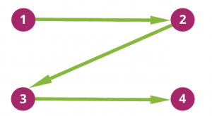
Place call to action where the eye travels
Numerous eye tracking studies have shown that people follow the F-shape of a web page with their eyes
![]()
Żródło: useit.com
To increase the effectiveness of the CTA, it is worth placing the button where the eyes stop. This will certainly increase the click trough rate.

Repeat Call To Action on the page
Don’t be afraid to use the same CTA repeatedly on web pages. As the user engages with the content, try to use an effective call-to-action now and then and encourage the customer to place an order or read another part of your offer. It’s worth to take care of user, but not forcing them to search the site and make them put the effort in it if the thought of taking up the offer and clicking the button sprouts in their heads.
KISS, Keep It Simple Stupid
Or put another way, Don’t Make Me Think. Depending on whether you want to encourage your audience to download free content, visit a sign-up page for a service, download an app, send a chat message, or any other action… Don’t make them think. On the internet, users have a huge number of alternatives available, which means that if your marketing recipient feels tired, they can leave the page immediately and never return to your offer.
The golden rule of Call To Action. Replace Call To Action with Call To Value
What if you replace Call To Action with Call To Value? People are unlikely to read your content for no reason. A user consuming content from your content marketing is most likely searching the content for a specific value for themselves. To influence your audience instead of emphasising your own point of view – create calls to action from the perspective of the benefits of your product or service. This means creating CTA text that gives a clear answer to the “what’s in it for me?” question the user might ask themselves. So when creating a call to action, you need to do it from the perspective of the clear benefits of your offer.
A CTA button can therefore include content substitutes that encourage the user to click like this:
“Buy a cooking course” -> “Learn to cook deliciously”
“Sign up for the newsletter” -> “Daily dose of new knowledge”
“Submit a form” -> “Order new …”
While the phrases used above may sometimes seem grammatically incorrect, to get a good CTA it’s sometimes worth thinking outside the box of the rules of certain language. After all, it’s your users’ actual actions that really matter if you run your own business. Whether a customer takes up your offer to subscribe to your newsletter, expresses a desire to receive additional messages or clicks a button on your website is the main determinant of the effectiveness of your CTA.
While the phrases used above may sometimes seem grammatically incorrect, to get a good CTA it’s sometimes worth thinking outside the box of the rules of certain language. After all, it’s your users’ actual actions that really matter if you run your own business. Whether a customer takes up your offer to subscribe to your newsletter, expresses a desire to receive additional messages or clicks a button on your website is the main determinant of the effectiveness of your CTA.
Check also


