Just because you can put almost anything on a website does not mean it is worth doing so. On many websites you will find solutions that are used without much thought. They add no value to the user and often discourage them from staying on the site.
Here are 10 examples of repetitive things that would be better to disappear from your website.
1. Social media buttons placed in the header of the page.
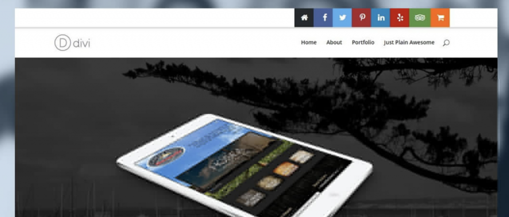
This is nothing more than a set of colourful encouragement to leave the page and go somewhere “more interesting”. Unless the purpose of your site is to drive traffic elsewhere, where proper user activation takes place, it is better not to encourage users to leave the site in this way.
Instead, a far better place to put social media icons is at the footer of the page. It is also worth using icons more consistent with the colour scheme of the page, not necessarily in the original colours of the specific social media.
2. Meaningless hero text.

To put it simply, it’s the creation of homepage header content, which does not bring the recipient any specific information. General, often high-flown statements, which usually fit nicely visually but do not bring the user any closer to understanding e.g. what the company does or what they can get by doing business with it.
5 seconds test
If you want to check whether the headline of your website has an informative value for customers, do the following test. Launch the page to someone who is not acquainted with it and let them read it, but only for five seconds. Close the page and ask him to say what he remembers or what the company does. If they can’t answer, you already know what you need to work on.
3. A full-screen pop-up that obscures the page content.
You enter a company’s website, you want to find out something about its offer or generally get to know its profile better, you see that in the background a video is running or some information is displayed on a slider but… you see nothing because everything is obscured by a huge banner encouraging you to sign up for a newsletter or agree to cookies.
You enter a company’s website, you want to find out something about its offer or generally get to know its profile better, you see that in the background a video is running or some information is displayed on a slider but… you see nothing because everything is obscured by a huge banner encouraging you to sign up for a newsletter or agree to cookies.
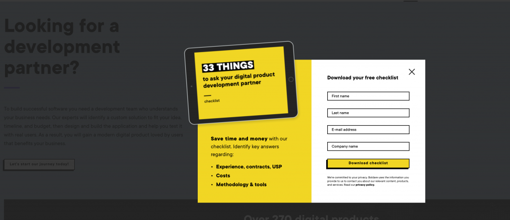
If you want to (reasonably) persuade users to leave an email address, configure the pop-up to appear when the recipient has already read at least part of the content. Let them make sure they can count on something valuable and are willing to “pay” for it with their own email address.
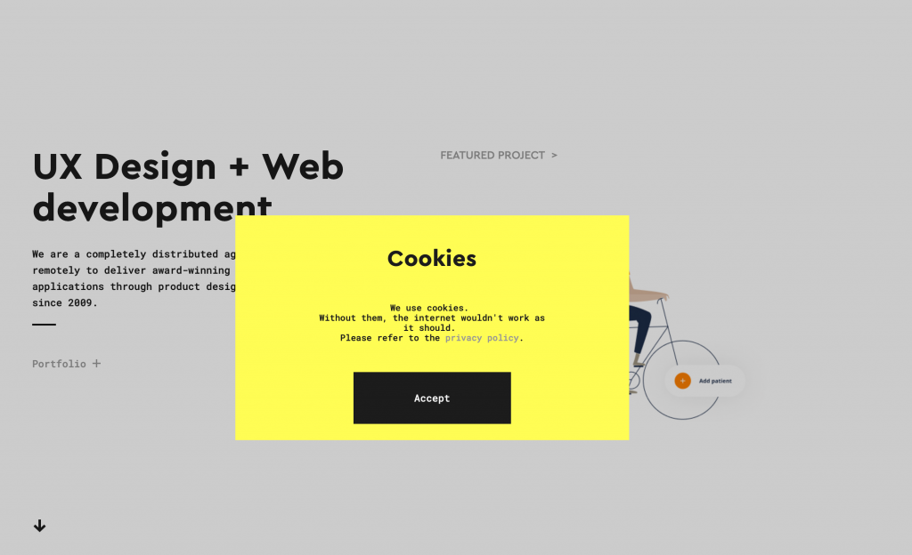
If you want to (reasonably) persuade users to leave an email address, configure the pop-up to appear when the recipient has already read at least part of the content. Let them make sure they can count on something valuable and are willing to “pay” for it with their own email address.
4. Stock images of people.
Research shows that we receive the message better if the photographs contain pictures of people whose faces we can associate with the brand or a specific message. The use of photographs that include stills from the life of the company, a team of professionals engaged in their work, or the smiling face of the owner will work well on users.

Using staged layouts of people as filler can work the opposite way. It takes all the authenticity out of the page and often doesn’t even convey the vibe that the company has. A company can be, for example, a small advertising agency where young, laid-back people work, while in a stock photo we see middle-aged people under a tie and in a corporate-like environment.
If you post photos of people, try to make them authentic and reflect the image of the company you want to build. If you don’t have a professional photos, you can take some shots of company life even with a smartphone. Authenticity over technical excellence.
5. PDF files. The rust of the internet.
How many times have you been forced to download your price list to disk? How often do you have to dig through a series of online PDFs to find specific information about a product or a company? Do you want to take the risk of downloading a virus-ridden attachment in order to find out what the company has to offer? How many times have you had to leave the website and look elsewhere because the information was not immediately available?
Companies are still putting downloadable PDF files on their sites. The reason why they do this is that the site is difficult to manage and adding content in other ways is much more difficult. Uploading a PDF seems a simpler and quicker affair than posting the same content within a specific website.
To easily check if your website also contains PDFs type in the search box: site:adrestwojejstrony.p pdf

You will see a list of PDFs from your site indexed by Google. It is definitely better if you provide the information they are looking for in a more direct way. Avoid forcing users to make extra effort, as they may go somewhere that is simply easier and more enjoyable.
The exception to the above would be when the PDF is filled with valuable downloadable content in exchange for contact information. The so-called lead magnet can be in the form of an e-book, case study or ready-to-print templates.
6. Banners with your own offer. If something looks like an advertisement, it probably is.
Probably, when browsing websites, you subconsciously skip content that looks like an advertisement. This phenomenon is called “banner blindness”. Most of us are sensitive to messages that look like aggressive advertising and we try to avoid such content.
Getting users’ attention in such an invasive way is rather a denial of good marketing.
If you want to get the user to act, it is much better to do it contextually, for example by highlighting links in the text or using good Call To Action.Call To Action.
7. Automatically play music or video.
What do you usually do when entering a website and suddenly music starts playing?
The surest way is to quickly find and press the “close tab” button. However, this is probably not the point of a website to chase users away from it. Some of them may have turned the volume to the maximum, watch your website e.g. at night and do not want to wake up their family. Or simply just scare themselves.
The situation is similar with video clips. Don’t run them automatically. If the recipient wants to watch it, they will click the play button themselves.
8. Useless 404 error pages
First, ensure that all links on the page work properly. However, if the user ends up on a 404 error page, it is worth ensuring them that it is not a dead end. You can use this page to point the user to other interesting places on your site that they might find interesting. It is also a good practice to place a search engine on the 404 page or redirect to the homepage. With a little creativity, you can also give the 404 page some character or humour.

Although the above advice should be valid for most company websites, it is always worth considering the specific goals you are setting for your website. Only by analysing best practices in the context of your business goals, can you be sure whether they should be applied.